Rudolph the Red Nosed Reindeer (1948) Max Fleischer Studios & Jam Handy Productions

>> 23 December 2011


The main reason I've fallen off from blogging is that I got a job over a year ago in the animation industry and have been putting in a lot of hours at work. It's been a fantastic adventure so far. But here we are, it's the holidays again, so I thought I'd purvey this little Christmas gem from 1948. It's only 8 minutes long so why don't you pull yerself up with a cup of morning coffee and sit a spell.

While Rankin-Bass gets all the love for their classic 1964 stop motion version of "Rudolph the Red Nosed Reindeer", the above featured animated short by Max Fleischer Studios was actually the first telling of the original story as written by Robert May in 1939.

May, a 34 year-old copywriter for the Chicago based department store Montgomery Ward's, was assigned to create a property in-house that could be developed into a promotional giveaway intended to boost Ward's 1939 Christmas sales.

At first May pitched his story ideas to his five year-old daughter Barbara and within a week delivered a rough draft of a Christmas story with rhyming couplets modeled after Clement C. Moore's "A Visit from St. Nicholas".

Initially Ward's publicity department decided to pass on the story. The feeling was that the imagery of a "red nose" was associated with drunkeness, rendering May's Christmas pitch inappropriate for children.

Denver Gillen, "Rudolph the Red Nosed
Reindeer " by Robert May


It wasn't until Denver Gillen, an illustrator in the company's art department, produced some initial concept drawings that anyone realized how endearing a character like Rudolph could actually be.

Gillen's illustrations were so cute that the publicity department came to the conclusion that there was no way people would think of Rudolph as a drunkard and the story was approved for production.

On September 1, 1939, Montgomery Ward's retail sales department announced the Rudolph book internally to all store managers with the following: “We believe that an exclusive story like this aggressively advertised in our newspaper ads and circulars... can bring every store an incalculable mount of publicity... and, far more important, a tremendous amount of Christmas traffic”.

They were right.

That year 2,365,016 copies of "Rudolph the Red-Nosed Reindeer" were given away. At the time, a production run of a mere 50,000 copies could make a book a best-seller. This overwhelming success garnered the property the “largest first edition yet recorded” by the press.

In 1948, Max Fleischer, acting as Head of the Animation Department for the Detroit-based industrial film company Jam Handy Productions, supervised the first animated adaptation of "Rudolph the Red Nosed Reindeer". It is this version that is more faithful to May's original story and Gillen's illustrations.  It's worth noting that unlike most Rudolph products, this cartoon has fallen out of copyright, and is now available in the public domain.

Happy Holi-daze, e'erbody!

My Dollar Store Craft: Blue Angel Votive Candle Holder

>> 20 December 2011


Inspired by the fantastic blogs "Dollar Store Crafts" and the Graphics Fairy I present my very own dollar store craft: this charming little votive candle holder featuring a blue angel. I've made a dozen or so of these candle holders as stocking stuffers for my office and now I've been asked to make a special order for my boss's Christmas dinner at home!

Project estimate:
  • Graphics Fairy "Best Little Angel Girl", free
  • Drinking glass, on hand or $1 and up
  • Homemade ModPodge, on hand or $1
  • Votive candles, on hand or $1
  • Wrapping paper, on hand or $1
  • Blue ink pad, on hand or $1
  • Glitter ribbon, on hand or $1
  • Various glues, on hand or $1 
  • Clear nail polish, (optional) on hand or $1
  • Nail polish remover, on hand or $1
  • Cotton balls, on hand or $1
  • Sponge brush, on hand or $1 
  • Xacto Knife or razor, on hand or $1 (for razor)
  • Scissors and paper edgers, on hand
  • Copy paper, on hand 
Now, at a dollar per project item, the price for this candle holder can accumulate quite quickly.  Use what you've got on hand to save on costs. The main things I purchased were the glasses, votive candles, wrapping paper and blue ink pad all sourced from my local Dollar Tree or 99 Cents Only stores. Everything else you see I had on hand but cost either only a dollar (from previous visits to these stores) or was completely free.  Please note: because of the use of sharps (razor or Xacto knife) I don't recommend fabricating this project with children for safety reasons.

Directions:
  • Start with making homemade ModPodge recipe by mixing 1 part glue (Elmer's is best -- but not the school glue, the regular glue) with 3 parts water. To make it glossy, throw in a bottle of clear nail polish.  Put all ingredients in a jar, twist lid to close and shake 'til well mixed.
  • Pre-cut gift wrapping paper to wrap around the glass. I chose a wedding style gift wrap that was mainly colored white, ivory and gold and then smudged it with a blue ink pad to blend and match the Graphics Fairy "Best Little Angel Girl" subject. It's hard to tell with the golden glow of the candle light in the photo but the wrapping paper background is tinted and mottled with the blue ink. It looks like it was manufactured that way.
  • Coat drinking glass with homemade ModPodge. Decoupage gift wrap around the glass.  Allow to dry but check in occasionally to smooth any paper wrinkles as it dries. 
  • Print out Graphics Fairy "Angel". I cut mine with Fiskars "Torn Paper" Edger scissors (discontinued). Edge with blue ink pad. 
  • Decoupage angel over wrapping paper on the opposite side of the seam. Allow to dry but check in occasionally to smooth any paper wrinkles as it dries. You can smooth by hand or use a brayer if you have one handy.
  • Print out the "Believe" label (or for my boss's Christmas dinner print out guest's names for each table setting) with the PegsannaHMK font available for free from Fonts101.com. I simply printed it out on regular copy paper and cut with Fiskar's "Majestic" Edger scissors. At this point you can smudge the label to distress or even edge the paper with the blue ink pad however I chose to let it remain white. Next time I would probably edge the paper just a bit with the ink pad to make it pop. Place label onto angel and then decoupage. Allow to dry.
  • After glass is completely dry, carefully trim the top of the glass with Xacto knife or razor blade to remove any paper that's sticking up over the rim.
  • Decoupage entire glass once more to seal. Allow to dry.
  • Once dry, carefully wipe off any remaining laquer (from the nail polish in the homemade ModPodge) that's on the glass (do NOT wipe the decoupaged papers -- just the exposed glass such as the bottom and the inside upper rim) with cotton ball and nail polish remover.  You want to clean up the exposed glass and make it sparkle. It also helps to make the project look clean and professional.
  • Next, apply blue glitter ribbon to the top and bottom edge of glass. Aleene's Original Tacky Glue is the best adhesive for this particular application due to it's "stickiness". That is, it stays put so that the ribbon doesn't slide down the glass as it dries.You could use regular glue but keep an eye on it as the ribbon may spring off or slide so you'll need to press it back on as it dries.
  • Insert votive, light and display!
Happy holidays!

Free Christmas Graphic PNG "Twas the Night Before Christmas" Illustrated by Jessie Willcox Smith (1912)

>> 11 December 2011

To download: PC-Right Click / Mac-CTRL Click the image above

Everyone knows the famous words: “‘Twas the night before Christmas, when all through the house . . .” Clement C. Moore’s famous poem entitled "A Visit from St. Nicholas" was written in 1822 and has been a holiday classic ever since. This gorgeous illustration featured above was published in 1912 by artist Jessie Willcox Smith and is considered by many to be the definitive version of the story. It's easy to see why: her wonderful art work captures the holiday spirit of Moore's poem in stunning detail.

A free digital version of this image is available in a transparent PNG file. If you're on a Mac, just CTRL-click the image above. If you're on a PC, simply right click on it.  After the page loads, drag the image to your desktop.

At 72 dpi, this file is best used for web design application including blog buttons, blog banners, and Etsy shop banners.

If you would like to use this file for printing, the recommended standard file size is 300 dpi as 72 dpi is too small a resolution for a quality print.  I have ACEO sized digital collage sheets in 300 dpi available at my Etsy shop.

In case you missed it, I also posted two free digital collage sheets of an 1864 publication of this same beloved Christmas poem available for download here.

Merry Christmas to all!


Free Digital Collage Sheet - "A Visit From St. Nicholas" by Clement C. Moore

>> 10 December 2011


Available now for free download are two 8.5 x 11" digital collage sheets of featuring 12 individual  ACEO/ATC sized illustrations of the classic holiday poem "A Visit from St. Nicholas".  The file downloads in a much high resolution than the placeholder image here.

This edition of the poem originally came as a fold out style pamphlet that was published in 1864 by L. Prang of Boston.  The copy I was working with was very delicate and pretty thrashed but I did my best to clean it up in PhotoShop, however you will notice some tears and aging when you look really close at the high resolution file (not the placeholder images featured here). What I love is that Santa is dressed in a little yellow suit. It's really quite cute! Just click on the images to get the freebie. Enjoy!

Free Digital Collage Sheet - Children's Storybook Illustrations by Virginia Frances Sterrett

>> 02 December 2011


This series of black and white storybook illustrations by Virginia Frances Sterrett. Her first commission came in 1919 from Penn Publishing Company to illustrate the Comptesse de Ségur's Old French Fairy Tales. She was only 19 years of age and received $500 for the eight watercolors and 16 pen and ink drawings, with a supplemental $250 for a colored drawing for the cover and ink drawings for the end papers and boards.  I also have some of the color illustrations as high resolution digital printable files in 8.5" x 11" and ATC ACEO sizes in my Etsy shop


Product Review: OttLite OTL13MAG Task/Magnifier Lamp with Flip-Down Magnifier

>> 27 November 2011

OttLite OTL13MAG Task/Magnifier Lamp 
with Flip-Down Magnifier
I got an OttLite last night and I LOVE IT!  This product is amazing. I didn't think it would make that much of a difference but now it's a lot easier to see a night when I'm crafting.  My average desk lamp and home lighting was just killing my eyes so I had to limit my craft hours to day time. And when you work a 9-to-5 that doesn't leave you with very many day light hours especially now that we're in the fall and winter months.  But now I can work at night and see with great clarity what I'm doing.   

No this is not a sponsored post so please keep reading!

I'd seen OttLites at Michael's and Joann's but failed to understand what they were all about.  I mean, I thought they were just another task lamp targeted for seniors and baby boomers. But I was wrong.

Last night at my friend Victoria's monthly craft night one of the ladies was using one and I could see quite clearly the amazing quality of the light.  The most important thing to me was that it didn't cause glare and hurt my eyes.  Also, the colors looked of my handicrafts looked great when held beneath this light source.  

I asked Victoria where the nearest Michaels was and told her I'd be back.  I had a 50% off coupon and wanted to use it.  However, the OttLite was already on sale for 50% off rendering the coupon unusable to this purchase. This meant I could buy something else for half off! :) 

I ended up purchasing the OttLite OTL13MAG Task/Magnifier Lamp with Flip-Down Magnifier in Dove Grey. When I got back to craft night I set it up immediately. The assembly directions were probably the lamest thing about this product. They were were worse than an Ikea diagram!

Thank goodness there was one already set up and its owner showed me how it was assembled.  I also didn't know that to turn it off or on all you had to do was close the clamshell light to its base.  I honestly don't think I could have figured it out if she hadn't shown me.

Other than that, the product is of very high quality and I also love how because of that clamshell design because it makes the OttLite very portable.

Also, in addition to doing my crafts with it, I've read it's great for photographing your finished product.  I haven't done this yet but if you notice an improvement in the white balance of my photos either here or on Etsy you'll know why!

Like I mentioned, Michael's is currently having a sale on the OttLite for 50% off but I've found better deals on Amazon with free shipping.  This may all be due to the fact that it's Thanksgiving weekend so on-line retailers maybe competing with brick and mortar storefronts and slashing prices. But it pays to shop around.

Whatever you pay for your OttLite -- whether its  sale or not -- it's totally worth it.  This task lamp is probably my number one tool for crafting and art work ever.  Seriously.


A Day of Thanksgiving + Free Thanksgiving Clipart

>> 24 November 2011


Released in 1951 by Centron Corporation " A Day of Thanksgiving" is about a working class family  experiencing financial hardships and so the parents have to break the news to the kids that there will be no turkey for Thanksgiving this year.

The film was written during the dark period in American history: the era of the House of Un-American Activities Committee and McCarthy-ism.  While the film gets a bit preachy for my tastes and the acting a little stilted,  the message is still worthwhile: an attitude of gratitude for family and friends.  Of course it's said with more words than that, yet this simple film makes for historical interest in comparison to the economic hardships of the the nation today.  Just like the family in this film, I won't be having any turkey this Thanksgiving but only because I'm preferring to try a vegetarian meal this year. 

My gratitude for all that I am and all that I have is like this little poem I've scanned from "Book Trails" copyrighted in 1928: "I am grateful for health, for food, for love and friends." 

Enjoy the freebie and Happy Thanksgiving to you and yours!


Click to embiggen

Unique Paper Mache Materials Technique and Weldbond Adhesive Product Review

>> 20 November 2011

New hat displays and wig stands in my Etsy shop.

I just uploaded my latest creations of mixed media wig stands and hat displays in my Etsy shop and now I want to break it down as to how I made them. If I knew how awesome they were gonna turn out, I would have photographed a full on tutorial. But I didn't. When I started making them, I was just going by intuition so now I need to back track a little bit because I want to talk about some of the techniques and materials I used.

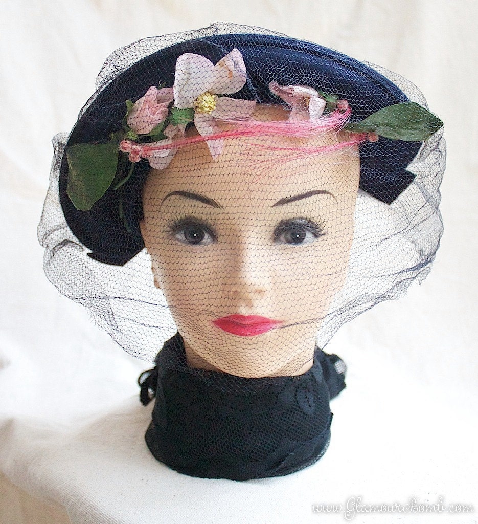
We'll begin with the fact that I wanted some pretty models for my vintage hats that I've have listed on Etsy.  So far I've used a beauty school dummy head (image left) which I think is OK, but I wanted to try something else.

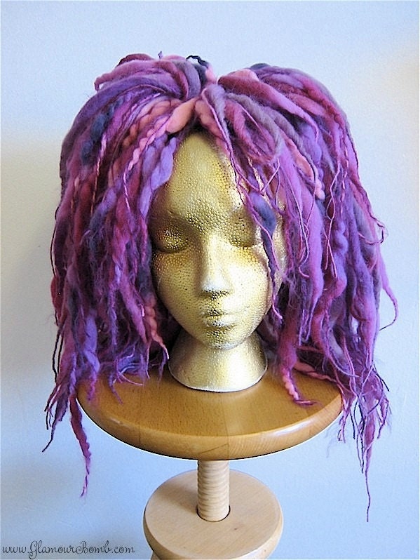
For my fairy kei wool dread falls, I use an average Styrofoam wig stand (image right) because I need to pin the falls into the head to make them stay on so I could photograph them. Now I think white Styrofoam looks cheap in a photo so I spray painted it gold to simulate a skin tones. I love the face on these displays, but I hate that Styrofoam. It makes it look like the skin is reptilian which is cool if you're going for that effect, but not good if you're trying to sell dread falls. I mean, wool dread falls are pretty avant garde already, but the reptilian skin is distracting and freakish and I think takes away from the product you're trying to sell.

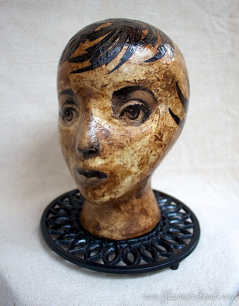
So here comes my ideas for hat displays for my latest round of vintage hats.  I took the same Styrofoam head style and made "Becky" (image left). I paper mached her with coffee filter paper and wallpaper adhesive that I got at Lowes with the idea that the face's skin would be smoother.  I made three layers of paper mache and let it dry for a day in between.  Then I sanded it smooth.

This is the paper mache technique I'm talking about: coffee filters and wallpaper adhesive!  I had both of these on hand so instead of running out to get more supplies, I just used what I got with great results.  Just shred the coffee filter paper by hand and as for the paper mache paste, simply add water to a glop of wallpaper adhesive until you get a consistency you like.  I can't really advise as to what the water to adhesive ratio is.  I just added water and stirred it with the wallpaper adhesive until it was thick and creamy.

What's great about using these two materials for a paper mache pulp is that when I went to color the head with walnut ink (that I also make and sell on Etsy) the paper mache grabbed the ink the way I wanted it to.  Also, wallpaper adhesive is anti-bacterial. It's meant to be that way so that mold doesn't grow between the paper and the drywall when used as indicated. So that means your paper mache work won't rot either! 

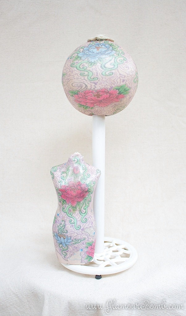
Now for shabby floral hat display (image right). I saw in the blog DIY Lunacy how Madz made a hat stand using Styrofoam ball.  I thought a paper towel holder would be perfect as a base because I wanted to mount the paper mache dress form you see pictured on the hat stand to use as a jewelry display.

To make this, again I paper-mached the Styrofoam ball with coffee filters and wallpaper adhesive to get a smoother texture.  Originally I  thought I was going to use the piece of metal that's on the side of the towel holder to mount the dress form but it just wasn't positioned where I wanted it to so I just removed the stick completely and mounted the dress form (as well as the ball) to the base using Weldbond glue.

Let's talk about Weldbond glue! It's pretty amazing!  All this time I've been using E-6000 for any and all serious hardcore adhesion applications. But now I think if I can use Weldbond on a project, I'll opt for that instead.  I love it because it's just as strong as E-6000 but not as stinky. So no fumes and no headaches.

Weldbond is also elastic and stretchy like E-6000 so things you adhere with it won't crack off as easily like hot glued projects. I also love Weldbond because it acts like your average Elmer's white glue when you apply it, so therefore I have a better experience in working with it to get the results I want.  E-6000 is more gooey and tacky like a relentless booger and I find it really hard to work with.  But Weldbond is water based glue therefore if you get it on something like your clothes, you can rinse it off with cold water. Just be sure to do it RIGHT AWAY before the glue hardens and sets.  Finally, Weldbond can be tinted with tea, paint and even nail polish.

Now I don't want to bash E-6000. It's still great stuff. I've been using it for years and will continue to do so with the right application to a project. For the record Weldbond has it's limitations but they weren't applicable to my hat stands and wig displays so I gave it a try and as you can tell, I really like it.

As things turned out, both these hat displays are really pretty in and of themselves but as a photographer's model for my vintage hats I find that they distract the eye.  I can't tell whether to look at the featured hat or look at the model.  I think they work as a unique piece of home decor or even better as a display in a boutique or crafts booth. So it looks like I'll keep experimenting with some ideas but use the old beauty school dummy head until I get the right model!

For the records, I am just a crafty vixen and not an employee for Weldbond. Furthermore, I have received no compensation to blog about them. However, if you work for Weldbond and you're reading this blog, can you please kick down some free product for me?  I'll try to think of more projects to make with it! =)  And if you're a rep for E6000, if you guy's kick down some free product I'll come up with unique and fantastic project that only E6000 can handle. XD

Oh, what an adventure I've had today!

>> 06 November 2011

See this hat on Etsy!
I was originally going to list this post in the "shop" portion of my blog but I simply had to tell you this amazing story of my armchair travels today.  It started when I went to list a vintage hat by American designer and milliner Marian Valle (left) in my Etsy shop.  It's cute, don'tcha think?

Well anyway, one of my favorite things to do when I offer up a vintage gem is to do a little research about the item and share the story of how it came to be.  So I type in "Marion Valle" and hit "I'm feeling lucky" and the first thing to surface is another hat by Valle that's also featured on Etsy. Isn't that funny?

Milliner Marion Valle's Spring Collection

I'm starting to really like Miss Valle's designs, but I still have no information on her so I dig a little deeper into my search and up pops this old news story from the Montreal Gazette dated March 22, 1934 in which Valle is interviewed for her new spring collection of hats. She is quoted as saying: "The upturn of our spirits is making itself felt in an upturn in our hat lines as well."

I continue  reading this edition of the paper when  I come across this amazing story about how Catherine Theresa Carr,  a 24 year-old Irish domestic from Belfast, spent eleven gruelling days hidden in a lifeboat on the ocean freighter Sulairia without food or water as she attempted to illegally immigrate to Canada.  She barely survived the ordeal and was taken into custody by immigration officials who promptly threw her in a hospital to recover from the effects of frostbite and extreme exposure upon docking in Halifax before deporting her.  The thing that fascinated me the most was that she said she was without hope with the prospect of being returned to Ireland and that she willingly suffered her hardships to come to America because back home "they work you to death."

A little more searching, and I learned from DIPPAM, an online virtual archive relating to the history of Ireland, and its migration experience from the 18th to the late 20th centuries that Miss Carr had made it back to Liverpool via the Cunard liner "Scythia".  Her story ends there, but still I wonder: what happened to her after that?  She would be 101 years old if she were alive today.  Oh, I'm so curious!

Laura Ingalls, American Aviator
At any rate, I continue to read the paper and learn about American aviator Laura Ingalls (not to be confused with author Laura Ingalls Wilder of the "Little House" series of books).  Laura Ingalls was was the first woman to fly over the Andes. She also made the first solo flight around South America in a landplane, the first flight by a woman from North America to South America, and in so doing, set a woman's distance record of 17,000 miles.

Lilyan Tashman, Actor
Finally, on the same day that these other previously aforementioned women made the news, I come to learn that glamorous movie star Lilyan Tashman died at the young age of 37 due to cancer.  A little more searching reveals that Tashman was a lesbian who had an affair with Greta Garbo!

I must say: phew!  It's been quite a day surfing  the net and learning all about what happened on March 22, 1934 just so I could list my pretty little chapeau on Etsy.   I'll wrap this up with a clip from 1931 film "Girls About Town" (below) featuring Tashman and directed by George Cukor.


Free Digital Collage Sheet - "Vintage Wall Street"

>> 24 October 2011


In response of the burgeoning Occupy movement that started on Wall Street a few weeks ago (but has since gone global) I thought it might be worthwhile to post this collage sheet I researched and put together. Perhaps you can use it in your mixed media and collage work?  All images are in the public domain.

Starting from upper left:

Image #1 (Upper left) - The Bankers Trust and Stock Exchange on Wall Street, New York. Photographed in 1912 by Irving Underhill.


Image #2 (Upper right) - The panic scene on Wall Street Wednesday morning, May 14, 1884 drawn by Schell and Hogan. Harper's weekly, v. 28, no. 1431 (1884 May 24), p. 333.


Image #3 (Bottom left) - Wall Street color lithograph. Artist Aug. Köllner. 1847.


Image #4 (Middle right) - Panic - "The Liveliest of Card Games” made by Panic Card Company, c. 1903.


Image #5 (Bottom right) - "Rotten Finance" cover of Puck Magazine, November 19, 1907. Illustration shows a stonewall labeled "Rotten Finance" constructed with stones showing the faces of many businessmen and financiers; on the ground, in front of the wall, is a broken egg labeled "Confidence". Among those pictured on the wall are John D. Rockefeller, J. Pierpont Morgan, and Edward H. Harriman. Artist Udo J. Keppler.

Below are the full resolution copies of these images available for download. Simply click on the image to embiggen.


How To Easily Clean A Vintage Coffee Percolator

>> 18 June 2011

Today's blog post is brought to you by... C O F F E E ! ! !


Click image to embiggen
Warning: I'm obsessed with ways to make good coffee on the cheap so I think several upcoming posts are going to be about coffee!  I'll resume my regular standard posts as soon as I get over this kick.

As I mentioned in my previous post, I'm totally into making coffee with a percolator.  It turns out, the brand I own is called a "Universal Coffee-matic" (image left) which was made by an American company called  Landers, Frary & Clark throughout the 50s and 60s. The company manufactured housewares from 1865 until its assets were sold to General Electric in 1965 when the brand itself faded into obscurity.

Landers, Frary & Clark may be a thing of the past, but my fantastic Coffee-matic still works and brews some excellent hot coffee.  I use it at work, where I bypass the crappy drip coffeemaker they've got going in the kitchen and percolate a batch every morning. Since I only consume one single cuppajoe a day, I share the remainder of the pot with co-workers.  The fun part is it's becoming a stone soup situation wherein they bring in delicious roasts from their local mom and pop coffee roasters for me to brew.

How To Clean A Vintage Coffee Percolator

Daily
On a daily basis, the interior of the pot (NOT the heating element) needs to be washed with hot soapy water after every use.  DO NOT IMMERSE the pot in water if you're using a Coffee-matic (like I am) or any non-immersible brand percolator or you'll destroy the heating element. Also: remember to unplug the darn thing before cleaning.

Monthly
On a monthly basis follow the steps below to really deep clean your percolator and get the most flavorful cup of coffee. I also recommend this method if you just purchased a used percolator. You'll need these supplies on hand: vinegar, baking soda, towel, toothpick, needle, pipe cleaner, dish brush, soap and water.
  1. Throw in 2 tablespoons of baking soda in the coffee basket and add water to the pot.  Turn it on and let it run through a percolating cycle. After it's complete, turn it off, wait for it to cool and then throw the liquid out.
  2. Fill the pot a second time with a 50/50 mixture of water and white vinegar and once again run it through a percolating cycle. Wait for pot to cool and throw the liquid out.
  3. Finally, fill the pot a third time this time with plain water and let it run through a percolator cycle.  Empty the water and allow the pot dry.  
  4. Wipe down the exterior with a towel but do not apply any scouring device, cleaning powders or steel wool because you will only damage it.
  5. Remove the pump tube and basket and thoroughly clean any debris or coffee residue with a combination of toothpick, needle, pipe cleaner or a brush as needed. Allow to dry.
  6. Inspect the washer and perk tube flange for debris.  If this element does not rattle upon shaking it, poke the holes with a needle, toothpick or pipe cleaner until it does.  Rinse and allow to dry.
  7. Reassemble all the pieces of your percolator and you're good to go!

In my next post, I'll offer my recipe for cold brew coffee!


"This Is Coffee" (1962) or "How To Percolate Coffee"

>> 14 June 2011


Last summer I went camping and enjoyed the best cup of joe I've had since my travels in Europe when I graduated high school. Maybe it was the great outdoors. Maybe it was the fresh clean air. My friend who brewed it fresh every morning swore it was the fact that it was percolated using a camping percolator coffee pot.

Life was good.

Summer came and went and along with it was those mornings of fresh coffee brought to my tent.

Sigh....

Cut to: this year where I'd been laid off and out of work for almost five months. Fun-employment can be pretty brutal and not so very fun so every day I went to my local multinational coffee chain store, paid $2 bucks for a cup of drip coffee and hammered away on my computer utilizing the store's free WIFI in search of my next gig which I got at the end of April.

Now I'm in a 9-5, at a desk with no windows so I remember fondly last summer's camping trip and the great coffee. I remember and wonder about my pals at my morning coffee klatsch as we pored over job listings and Craigslist posts.  But one thing's for sure: I don't miss spending $14 a week on coffee.

Do. The. Math: a two buck-a-day habit multiplied by 365 days and your average coffee expense amounts to a whopping $730 a year! That's a round trip ticket to Paris or a cruise in the Hawaiian Islands, egads! I mean, that's a lot of money, especially when you're coming off an extended bout of unemployment and accepting significantly less pay than you're used to because of this economy.

Now my new gig has a coffee service, and the coffee is just OK. The brand is good, so I'm thinking that maybe it's the coffee maker itself from which flows this mediocre coffee and wouldn't you know it? I was right!

I went out to my local thrift shop and got a good old-fashioned electric coffee percolator, cleaned it out really good with vinegar and starting making my own fresh perc'd coffee and let me tell you (exaggerated sotto voce): it tastes 100% better.

But it took awhile to get it right. At first, I was flummoxed. I paid only $4 bucks for the percolator but I didn't have the foggiest idea on how to use it. My camping buddy made the coffee daily, so while I was blissfully caffeinated I was also an utter doofus for failing to get the instructions on how to make it from him.

So I went on-line and found several forums and tutorials. There seems to be a huge debate from many coffee snobs who argue the merits of drip or even French pressed coffee over  percolated coffee.

However, for me, percolated coffee tastes better, is darker and stronger, and the equipment is much less expensive. There no filters to change or buy so I save the trees while making things easier on my wallet and the environment. Not only that,  but my co-workers also think it's better tasting than the company's coffee maker or the local multinational coffee chain store down the street.

I think the trick is I make it strong and the percolator dispenses it hot so like, who doesn't like strong hot coffee? Right?

This documentary was brought to you by the Coffee Brewers Institute and produced by Visions Associates. On one forum I read where this guy took a class from the institute back in the fifties when he claims he was the night manager at Hody's Restaurant in Hollywood.  He said that upon completion of instruction "We were awarded a 1/2 gold colored coffee cup and hung it over the entrance to the bar."

So when you get a moment, would you be so kind as to put down that cuppa joe and let me know your secret for the best method for making coffee? Cheers!


How To Add FancyBox to Blogger/Blogspot in 7 Steps

>> 05 June 2011

Hello everybody!

Long time no post, but I'm back today with a nifty tutorial on how to add lightbox effects to photos posted to Blogger/Blogspot.

Did you notice I didn't entitle this post "How To Add FancyBox to Blogger/Blogspot in 7 Easy Steps"?

That's because adding this feature takes some pretty advanced coding skills so be prepared to spend some time with this and look up other tutorials on the Web if my directions fail to give you results.  I installed this feature through trial and error and took me about four hours to get it right.

We'll be using a free tool called FancyBox which displays images, html content and multi-media "lightbox" that floats overtop of web page. Click on the photo (above left) of the glamourously bombastic Audrey Hepburn to see what I'm talkin' about!

FYI: this  photo and more very high quality images of famous screen stars can be grabbed for free from Dr. Macro's High Quality Movie Scans.

OK! Now that you've seen what FancyBox can do you want it too,  right? Let's get crackin' on how to install it!


HOW TO ADD FANCYBOX TO BLOGGER

Step #1
First of all BACKUP your template just in case you want to revert back to it.

Step #2
Download FancyBox for free!

Step #3
Rename the downloaded FancyBox folder to something simple like "fb".

Step #4
Upload the folder to your webhost. In this case you will need to use a hosting service to store the FancyBox files because Blogger/Blogspot does not offer storage capability. If you don't have a hosting service, you can get 2gb of storage from Dropbox for free ⬅ Please use this URL so I also can get some free additonal storage in referring them to you!

Step #5
Open the file "jquery.fancybox-1.3.4.css", change all the image URL to the correct image path. Scroll through the text box directly below to view an example of what it's supposed to look like. Remember to change all the URLs in the css document to your webhost. Upload the css file to your hosting site after you're done editing it.


Step #6
On Blogger, go to Edit HTML tab under Design, paste the following code before the </head> tag:


Make sure to change the js and css files to the correct path. I've highlighted the required changes for you!

Step #7
Upload your photos to your blog as you normally would. Then modify the code for the image under the "Edit HTML" tab from this:

<a href="https://blogger.googleusercontent.com/img/b/R29vZ2xl/AVvXsEhAZlLsSFm68lCu0HW7grOzO3Ma680lILv8farAewzo2Acxne3fTm6g33I6m-PVTZVmCWVQMpGBQW_i0eKf-3lxjv-wR3IsyE64ZU9pKAmLCd4IOAzSjAqtHXlj5YZ2SejXW2oNWpNUmyTC/s800/Annex%252520-%252520Hepburn%25252C%252520Audrey_061.jpg" imageanchor="1" style=""><img border="0" height="240" width="400" src="https://blogger.googleusercontent.com/img/b/R29vZ2xl/AVvXsEhAZlLsSFm68lCu0HW7grOzO3Ma680lILv8farAewzo2Acxne3fTm6g33I6m-PVTZVmCWVQMpGBQW_i0eKf-3lxjv-wR3IsyE64ZU9pKAmLCd4IOAzSjAqtHXlj5YZ2SejXW2oNWpNUmyTC/s800/Annex%252520-%252520Hepburn%25252C%252520Audrey_061.jpg" /></a>

 to this:

<a class="default" rel="fancybox" title:"Download FancyBox" href="https://blogger.googleusercontent.com/img/b/R29vZ2xl/AVvXsEhAZlLsSFm68lCu0HW7grOzO3Ma680lILv8farAewzo2Acxne3fTm6g33I6m-PVTZVmCWVQMpGBQW_i0eKf-3lxjv-wR3IsyE64ZU9pKAmLCd4IOAzSjAqtHXlj5YZ2SejXW2oNWpNUmyTC/s800/Annex%252520-%252520Hepburn%25252C%252520Audrey_061.jpg" imageanchor="1" style=""><img border="0" height="240" width="400" src="https://blogger.googleusercontent.com/img/b/R29vZ2xl/AVvXsEhAZlLsSFm68lCu0HW7grOzO3Ma680lILv8farAewzo2Acxne3fTm6g33I6m-PVTZVmCWVQMpGBQW_i0eKf-3lxjv-wR3IsyE64ZU9pKAmLCd4IOAzSjAqtHXlj5YZ2SejXW2oNWpNUmyTC/s800/Annex%252520-%252520Hepburn%25252C%252520Audrey_061.jpg" /></a>

That is to say to insert the code class="default" rel="fancybox" title:"Download Fancybox"
in between the the "a" and "href" of  "a href=".

I'm still pretty new to this so I'm not sure if I can assist you if you have any issues.  I had to fiddle with it for awhile to get it to work, but it was worth it.  If you need support, your best bet is to read the "How To" page directly on the FancyBox website.  If you have better methods on how to install FancyBox, I'd appreciate (as would other readers of this blog) if you would post your tips in the comments below.

Quick Update

>> 10 March 2011

Hey everybody!

It's been awhile, I know.  I just wanted to post a quick update that I'm redesigning my website and it's going to affect the feed of this blog as I transfer domain name servers.  It's because I will no longer be using Blogger as a custom domain name but am reverting back to the Blogger domain name.

For example: when you clicked on any page on this site it used to read something like "http://glamourbomb.com/anypage" in the address bar.

However now if you click on a page it will read something like "http://glamourbomb.blogspot.com/anypage" instead.  Like I said, I'm reverting my custom domain back from Blogger and using it on a brand new site.

I'm NOT abandoning the Blogger platform. I will still be blogging here.  I just want to do more than what Blogger can provide.  I want to actually open a shop with a cart service and I haven't really been able to do that on Blogger except here and there when I insert a PayPal button in a blog post.  And sometimes what I have to offer doesn't fit Etsy's selling guidelines so I have to do indie and set up my own website with a store.

All these changes are going to effect this blog insofar that you may see double posts or posts that are old show up for some weird reason. Anything can happen until the transfer is complete. I'm sorry about that. At least it's just hiccups and not full on burps!!!   :)

I'll be posting an update when all is said and done but for now if you're interested to take a peek at what I'm up to, I've put up a basic splash page for now and you can see  it here.


The True Cost of Selling on Etsy

>> 18 January 2011

I've been sitting here doing some math and realizing I often undersell myself on Etsy just because I price things on what I'd be willing to pay for them. According to all I've been reading, this is just plain foolish.

Before I share with you how I got my bearings on what to charge, first you need to know a little bit more about what I was thinking (which honestly, I really wasn't :).

In poring over Etsy's highly informative members blog called Storque I've come to realize that I need to be more mindful in taking into account my true costs and that includes overhead costs such as Etsy and Paypal fees as well as packaging costs. I also need to consider the time involved to prepare an item for listing which includes photography work and description writing.


It Adds Up!

Any Etsyan will tell you it costs $.20 per listing plus 3.5% of total sale to list an item on Etsy. It also costs $.30 per transaction and 2.9% of the transaction amount to make your customer's life a little easier by using PayPal.

So remember to add the combined costs per listing/transaction of $0.50 ($0.20 + $0.30) plus the 6.4% (3.5% + 2.9%) when figuring out your price for a listing.

That's $.50 + 6.4% in costs and fees to list your item so use this equation when factoring the price!

These costs ain't bad if you're doing all your sales on-line and don't have to worry about renting out a brick and mortar space or sales booth but they do add up.

It's important to keep in mind that these figures are only the base line. They don't take into account whatever it cost you in purchasing supplies, transportation costs, interest fees if you use a credit card to leverage creating items for sale, tools and equipment, taking photos, creating listings or your work hours.

And let's talk about shipping for a minute: I usually charge the true price of shipping plus whatever it costs for the packaging. That includes the manilla envelopes, packing bubbles, boxes, big juicy 1/2 sheet shipping label, tape, business card and promotional items, packing slip, etc. If it's an awkward number of just a few cents, I'll round it up to make the math easier for me in my head but I don't aim to overcharge on shipping.


One Friend's Pricing Method

I have a friend who manufactures high quality silk and wool scarves that retails at finer department stores. She runs her business out of the California Mart in downtown Los Angeles. The venue is home to hundreds of wholesale showrooms for fashion, textiles, gifts and home decor. She told me her pricing method was to take into account all her true costs plus her hourly wage which she wouldn't tell me but she threw out the the imaginary amount of say $30.00 per hour. That includes developing and creating the item, as well as preparing it for listing and ultimately handling it for shipping.

Then she said to take all those numbers: the itemized costs, the hourly rate and add it all together and THEN multiply that sum by three to come to a price. That's right: triple the number!

While I don't do all that, as I mentioned from the start, I also undersell myself, too. Like I said, I usually price an item to what I'd be willing to pay for it. I also take into consideration that my sales are not my lifeblood when figuring out what I hope is a fair price. I mean, the stuff I put up on Etsy is not my business per se. It's an avocation. So I don't have other things to consider like employees, insurance, licenses, taxes, etc. But minimizing my production efforts and comparing them to a successful apparel manufacturer is self-defeating. I need to work smarter!


Presenting: The Etsy Fee Calculator

The Etsy Fee Calculator by Ryan Olbe
Determining the true cost of your work and what to fairly charge a customer can get complicated -- yes ma'am it sure does. I got kerfuffled. Doing math is not my idea of fun. But after spending hours freaking out over the numbers, I found this really great tool called the "Etsy Fee Calculator" by Ryan Olbe. It's pretty cool and it made my life so much easier.

The Etsy Fee Calculator is a free web-based tool can be used to easily calculate Etsy fees and PayPal fees for any amount. It also supports multiple quantity listings and has a special field for your "cost of materials".

I especially like the Reverse Fee Mode feature. This allows you to enter the amount you want to receive after fees and the calculator can tell you what price you would need to sell your item for or how much to charge for shipping & handling, to receive that amount.

This Etsy Fee Calculator is just so super awesome that I had to share it. Now you can quickly determine your what your Etsy fees would be and how much profit you can make from selling an item. That said, most of what I sell on Etsy was initially created out of the sheer joy of making. It's fun and that's why I do it! But I'm interested to know how other crafters determine the price for what they sell whether it be on Etsy or otherwise.


Related Posts Plugin for WordPress, Blogger...

  © Blogger template by Ourblogtemplates.com. Custom theme by Glamour Bomb, 2009.

Back to TOP